Digital Wall Visual Identity Moodboards
These moodboards capture three possible visual identity directions for Digital Wall. They are reference assets for product design, UI polish, object styling, scene composition, and future day-cycle exploration.
For the full index of walls, items, screenshots, and style lanes, see VISUAL_CATALOGUE.md.
Hearth Pixel
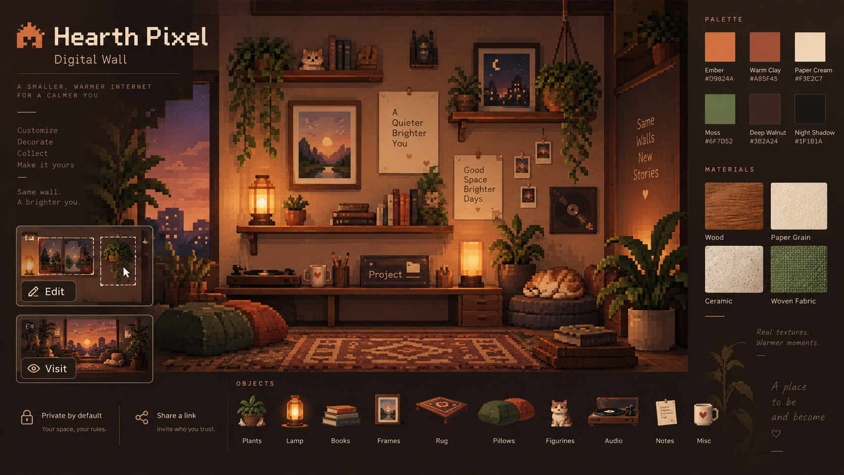
Warm, grounded, cozy, and intimate. Hearth Pixel is the most emotionally immediate direction: amber light, collected objects, paper grain, wood, plants, shelves, and a central wall that feels lived-in without becoming cluttered.
Palette anchors: ember, warm clay, paper cream, moss, deep walnut, night shadow.
Hero time of day: dusk or evening. The same identity can support morning, afternoon, and night by shifting warmth, lamp intensity, shadow depth, and exterior light.
Moonroom
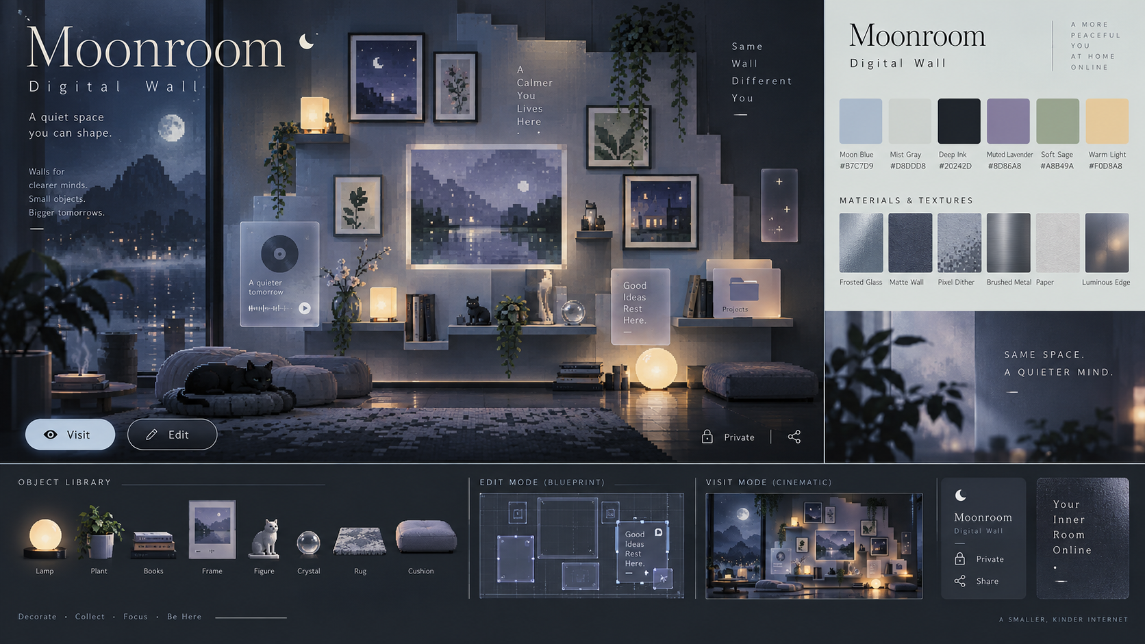
Cool, quiet, meditative, and premium. Moonroom frames Digital Wall as a calm personal space with a more refined product identity: translucent cards, soft luminous edges, misted blues, minimal UI chrome, and a cinematic visit mode.
Palette anchors: moon blue, mist gray, deep ink, muted lavender, soft sage, warm light.
Hero time of day: night or moonlit late evening. Daytime variants should feel like a quiet studio or gallery rather than cheerful daylight.
Garden Terminal
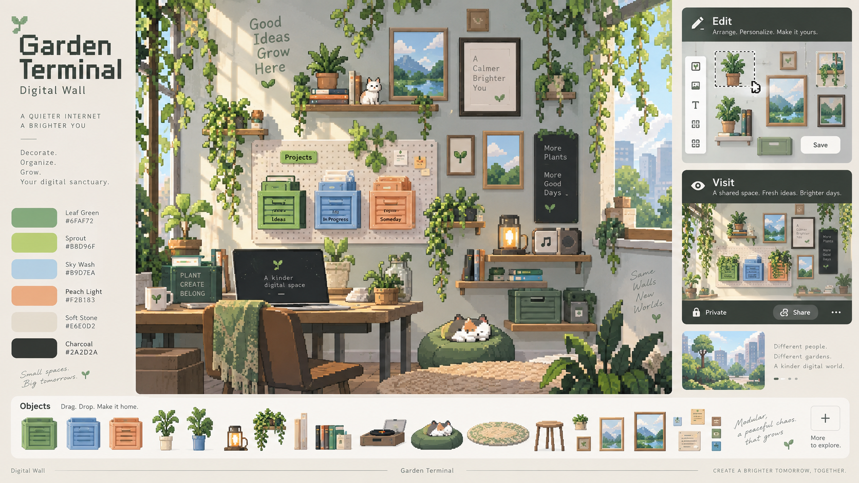
Fresh, modular, expandable, and gently playful. Garden Terminal leans into the future object system: project crates, plant growth, modular shelves, morning light, draggable objects, and a brighter creative workspace feeling.
Palette anchors: leaf green, sprout, sky wash, peach light, soft stone, charcoal.
Hero time of day: morning or daylight. This direction naturally supports day-cycle changes through window light, plant shadows, golden hour warmth, and nighttime grow-light details.
Shared Notes
The three boards are separate identity directions, not merely different times of day. Any chosen direction should be able to handle a time-of-day system while preserving its core material language, palette relationships, object shapes, and mood.
For MVP exploration, Moonroom feels most differentiated, Hearth Pixel feels most emotionally sticky, and Garden Terminal feels most extensible for future customization and project-object systems.
Style lane catalogue
For craft-lane references (NES / SNES / MapleStory cartoon / Lofi Girl) and a Visit-vs-Edit mode split, see style-lane-catalogue/README.md.
External inspiration
Live third-party room references (research only): Fahim Arifen Pixel Workspace — strongest match for Hearth Pixel visit immersion, day-cycle lighting, and clickable room objects (lamp, CRT, weather/audio).